


You've created terrific content for your webpage and you're ready to share it with the world. This...
Websites are, in many cases, the first impression that people will have of you and your organization. It is 2017 and most everyone has an online presence, but is your presence sending the right messages, and is it directing your readers’ attention where you want them to go?
When adding content to your website, you may want to consider….
Where is your reader’s eye going?
Figuring out where to place content on a page is almost as important as the content itself. Consider your images and how the reader will follow them. Does the most important content, usually a call-to-action, stand out on the page? Does it help direct your readers’ eye to the words you want them to read? Take a look at the image below:
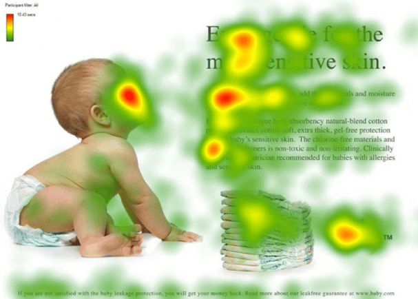
Image credit: Kissmetrics
The heat map shows where a readers’ eye goes on the page. Humans are prone to looking at faces and following the gaze of other people, so by facing the baby toward the content, the content is getting more attention.
Another point to consider is the infamous ‘f-shape.’ In the image above and the one below, you can see that people generally scan content and tend to look at the left side of the page.
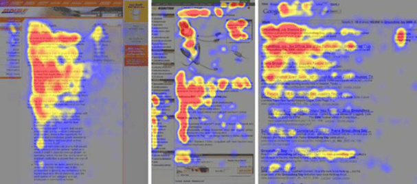
Image credit: Kissmetrics
If possible, make sure your most important content is easily scannable and within the range of the ‘f-shape.’ It will make your website visitors a lot more likely to actually read your content!
What is the most attention-grabbing content on the page?
When you look at your webpage, what is the first thing you see? Is it a clickable link, an image or a call-to-action? If the first thing you see isn’t the content that you want your visitors to read, consider making a change to make your most important content the most attention-grabbing.
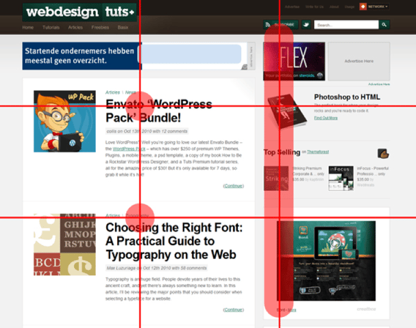
For visuals, remember to think about the rule of thirds. The eye is naturally drawn to where the grid intersects, so make sure to place your most compelling images as close to the intersections as possible.
For text, remember the ‘f-shape’ and know that readers are most likely just scanning the page. Make important titles bold, and use compelling headlines to draw attention to your most important content. Compelling headlines use emotion, positive and negative, and curiosity, sometimes in the form of a question, to draw attention to content and make a reader want to do more than scan the page.
How dated is your overall design?
2017 is shaping up to be a year for more minimalistic, colorful web pages. Other trends include infinite scrolling webpages and highly responsive designs that look beautiful on any device. It’s obvious when a website hasn’t been updated in a while, so make sure your website looks like it has been updated recently.
For a good example of this, visit www.igpr.com. The page moves as you scroll, with the most important content centered on the page and immediately visible. The bold colors help make the page pop, but without being obnoxious to look at. It’s an attractive website that stands out without overwhelming the reader.
By following the best practices above, you will ensure that your website is attractive and compelling! Need help with your website design or content? Click here!